A long time ago, in a graphics world far, far away from the digital one of today, I used to make images with pen and ink, and the occasional bit of white-out. Print was my intention as the final manifestation of my images, so I didn't mind using some white out now and then, if I had to. But it was never ideal as ink does not sit well on top of lumpy white-out.
••••••••••
Blonde joke from the eighties: How can you tell if a blonde has been using your computer? There's white-out on the screen.
••••••••••
I worked in black and white because printing in black and white was so much simpler and less expensive than printing in more than one color or CMYK full color. I was also influenced by illustrators of the 18th and 19th century whose work I admired.
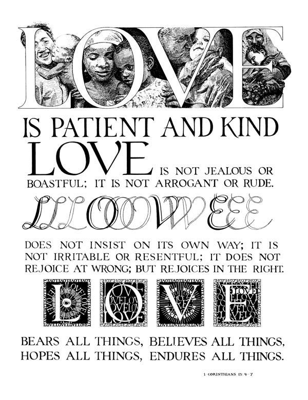
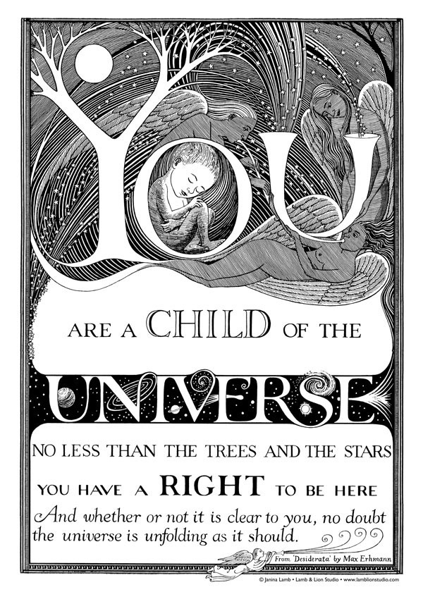
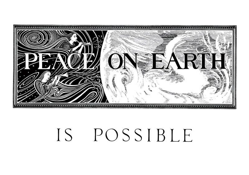
The following images were photographed by a stat camera to make a printing plate. That mechanical technology was much closer to the drawn image than a digital translation. A line was a line, not a bunch of pixels.
This poster marked the beginning of Lamb & Lion Studio, though I didn't call it that until a year or two later. The first printing was 18 x 24 inches. Later I reduced it to 12 x 16, as well as to a 5 x 7 notecard.
All the images in this post are hand-lettered. It’s clear that I liked drawing letters, especially fancy decorated letters, but the difficulty of making actual letters from a font appear on a substrate to be printed factored into my drawing of letters.
In the very, very olden days, when I worked for a few months in a preparation-for-print shop in NYC, letters had to be created either on a typewriter with exchangeable font wheels, or a photographic technique which created letters on a substrate. All this type then was pasted down onto the document that would eventually be turned into a printing plate after being photographed by a stat camera.
The digital world and the ease with which one could make letters changed the equation of what it made sense to letter by hand and what didn’t.
Another all pen and ink drawing except for the very delicate border which was another ancient tool called 'border tape.' Fancy stick-on stuff . . .
The two-color posters below were separated by hand.
The Earth Pledge uses two colors, sometimes screened, which means little dots that represent a percentage of the full color. The words 'ONE PLANET' is 20% black to 100% of the blue. This is also true of the darker blue areas on the earth. And I think there is a blue screen under the black to make it deeper and blacker.
The Earth Pledge poster has been reprinted many times, and every time I print it I agonize over what blue to use. Sometimes I go with 100% cyan, and sometimes I use a color that has a slightly greener tint.
One of the more interesting comments I have received about this poster is that it uses too many fonts. I see the point, but it's sort of funny when everything is hand-drawn. I have also been told that it shouldn't say 'the' earth, because the name of the planet is Earth.
This two-color poster was also created the old-fashioned way, with a black and white ink drawing, and then a rubylith overlay in which the white areas were very carefully cut away with a swivel knife. There was a craftsman's eye-hand coordination necessary for this kind of work which went far beyond the control needed for computer graphics.
More hand-lettering, and that handy dandy border tape.
Drawn in pencil, then pen and ink. I took some photos of this mother and daughter duo to use as a reference.
Some, not all, of these images are still available on my website, Lamb & Lion Studio. Some may be available soon though a new print on demand system I am setting up. If you would like notification, please sign up for my mailing list on the website (though you will probably get that info here also).


Thank you for our visit to the olden days....it was so interesting.